移动端布局
- 媒体查询+rem(适配方案)
为使得页面布局不管在什么设备上都是正常,协调的情况,就会采用媒体查询 + rem,来根据不同的设备去相应的改变元素的大小。(很多时候为了方便宽度会去%单位)
- rem
-
字体单位
值根据html根元素大小而定,同样可以作为宽度/高度的单位。
-
适配原理
将px替换成rem,动态修改html的font-size适配(1rem=(html的font-size))
- 使用media适配不同大小的设备(缺点:需要添加很多的media条件)
@media screen and (max-width:360px) and (min-width:321px) { html { font-size: 20px; } } @media screen and (max-width:320px) { html { font-size: 24px; } } @media screen and (max-width:360px) { html { font-size: 20px; } }- 使用js动态修改
      window.addEventListener('resize',()=>{
          // 获取视窗宽度
          let htmlWidth = document.documentElement.clientWidth || document.body.clientWidth;
          // 获取html元素
          let let htmlDom = document.getElementsByTagName('html')[0];

          htmlDom.style.fontSize = htmlWidth/10 + 'px';
      })
.hello { width: pxTorem(100px); height: pxTorem(100px); &.b { width: pxTorem(50px); height: pxTorem(50px); } } @function pxTorem($px){ /* iphone 6为基础 375 */ $rem: 37.5px; @return ($px/$rem) + rem; } -
兼容性
IOS6以上和android2.1以上,基本覆盖所有的流行手机系统
-
- 媒体查询(查看之前的文章有详细讲解)
- flex流式布局
- flex布局左边固定宽度,右边自适应
  <div class="goods">
    <div class="menu-wrapper">
    <div class="foods-wrapper">
  </div>
  .goods
    display: flex
    position: absolute
    top: 174px
    bottom: 46px
    width: 100%
    overflow: hidden
    .menu-wrapper
      flex: 0 0 80px
      // 解决android浏览器兼容问题
      width: 80px
      background: #f3f5f7
    .foods-wrapper
      flex: 1
- flex常用属性
- flex 属性
flex(flex-grow | flex-shrink | flex-basis )(flex-grow空间充足时等分放大倍数/flex-shrink空间不足时缩小比例/ flex-basis元素占位值) 简写:flex:1 flex:auto flex:none => flex: 1 1 auto flex:0 1 auto flex: 0 0 auto
- display:flex/flex-direction/justify-content/align-items…这里就展开详解了
-
vm布局方案(ios8和android 4.4以上)
- vm: 1vm等于视口宽度的1%
- vh: 1vh等于视口高度的1%
- vmin:选取vw/vh中最小的那个
- vmax:选取vw/vh中最大的那个
-
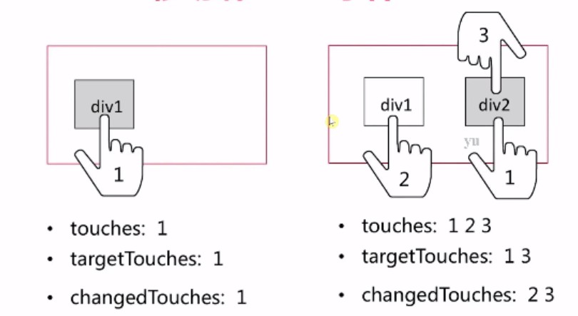
touch事件
- touchstart
- touchmove
- touchend
- touchcancel
总结最常用的用法:移动端通用布局方案(定高,宽度百分比/flex流式布局/Media Query(媒体查询)) 或者 vw方案
- 淘宝弹性布局方案flexible
常见问题
- 为什么很多PC端网站在手机上打开会出现等比例缩小的情况,原理是什么?
答:这是属于浏览器本身的特性,浏览器会将页面缩小到visual viewport的可视区域内。导致的问题就是页面的内容被缩小,不方便观看。
- 如何将理想视窗等于设备的物理视窗达到显示的完美效果?
答:
<meta name="viewport" content="width=device-width, initial-scale=1.0, maximum-scale=1.0, user-scalable=no"/>
- 移动端300ms延时产生原因和消除方法?
答:因为浏览器需要300ms的事件判断是点击事件还是双击事件(双击会缩放屏幕),所以在移动端浏览器会出现300ms的问题。解决方法:① 在meta标签中禁止用户缩放功能(safri是不支持的)。② Tap组件(FastClick,react-tap):原理是利用touchstart和touchmove去判断是否有后续操作(在新ios上已经移除300ms的功能)。
- 1px边框实现(见另一篇文章)
伪类实现1px边框,利用css3中transform:scaleY(0.5);
.scale-1px {
    position: relative;
    border: none;
}

.scale-1px:after {
    content: '';
    position: absolute;
    height: 1px;
    width: 100%;
    bottom: 0;
    left: 0;
    -webkit-transform: scaleY(0.5);
    transform: scaleY(0.5);
    -webkit-transform-origin: 0 0;
    transform-origin: 0 0;
}
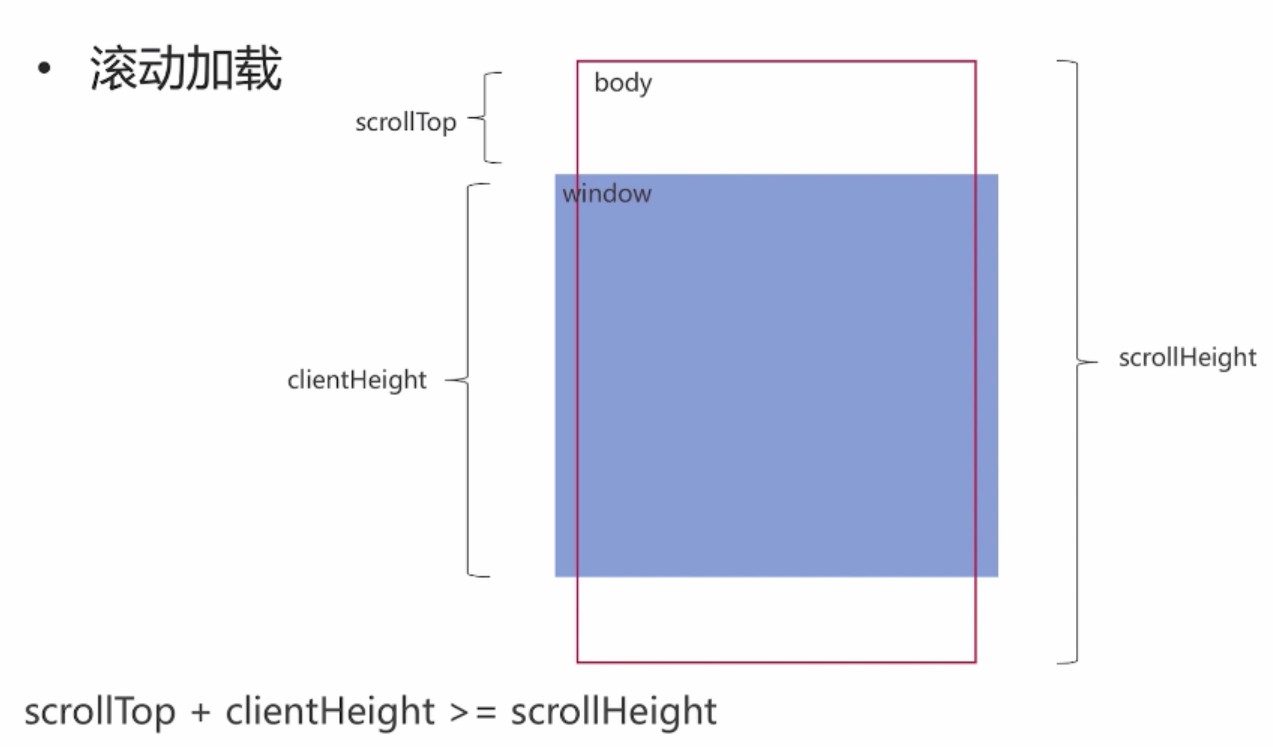
- 滚动加载数据(上拉加载数据)
原理解析:如下图所示scollTop+clientHieght >= scollHeight 代表滚动到了底部,需要加载新数据
在react中组件实现滚动数据加载:
// ScrollView.jsx
import React from 'react';

import Loading from 'component/Loading/Loading.jsx';


import { connect } from 'react-redux';

/**
 * <ScrollView loadCallback={function} isend={bool}/>
 * @description 滚动加载组件
 */

class ScrollView extends React.Component {
    constructor(props) {
        super(props);
        this._onLoadPage = this.onLoadPage.bind(this);
    }
    onLoadPage(){

        let clientHeight = document.documentElement.clientHeight;
        let scrollHeight = document.body.scrollHeight;
        let scrollTop = document.documentElement.scrollTop || document.body.scrollTop;

        let proLoadDis = 30;
        // 滚动到底部加载数据的判断
        if ((scrollTop + clientHeight) >= (scrollHeight - proLoadDis)) {


            if (!this.props.isend) {

                if (!this.props.readyToLoad) {
                    return;
                }
                // 调用父组件的方法,请求并获取数据以及判断页码
                this.props.loadCallback && this.props.loadCallback();
            }

        }
    }

    componentDidMount(){

        window.addEventListener('scroll', this._onLoadPage);
    }
    componentWillUnmount(){

        window.removeEventListener('scroll', this._onLoadPage);
    }
    render(){
        return (
            <div className="scrollview">
                {/*加载所有的子元素或者组件*/}
                {this.props.children}
                <Loading isend={this.props.isend}/>
            </div>
        );

    }
}


export default connect(
    state =>({
        readyToLoad: state.scrollViewReducer.readyToLoad,
    })
)(ScrollView);
// Loading.jsx
import React from 'react';

/**
 * Loading组件
 */

class Loading extends React.Component {
    render(){
        let str = '加载中';
        if (this.props.isend) {
            str = '已完成';
        }

        return <div className="loading">{str}</div>;
    }

}
// ContentList.vue是父组件
import React from 'react';
import { connect } from 'react-redux';

import ListItem from 'component/ListItem/ListItem.jsx';

import ScrollView from 'component/ScrollView/ScrollView.jsx';

import { getListData } from '../../actions/contentListAction';


/**
 * @constructor <ContentList />
 * @description 附近商家列表
 */

class ContentList extends React.Component {
    constructor(props) {
        super(props);

        // 记录当前页码
        this.page = 0;

        // 请求第一屏数据
        this.fetchData(this.page);

        // 标识页面是否可以滚动
        this.state = {
            isend: false
        };

    }

    onLoadPage(){
        this.page++;
        // 最多滚动3页3次
        if (this.page > 3) {
            this.setState({
                isend: true
            });
        } else {
            this.fetchData(this.page);
        }
    }

    fetchData(page){
        this.props.dispatch(getListData(page));

    }


    renderItems(){
        let list = this.props.list;
        return list.map((item, index)=>{
            return <ListItem key={index} itemData={item}></ListItem>
        });
    }

    render(){
        return (
            <div className="list-content">
                <h4 className="list-title">
                    <span className="title-line"></span>
                    <span>附近商家</span>
                    <span className="title-line"></span>
                </h4>
                <ScrollView dis="content" loadCallback={this.onLoadPage.bind(this)} isend={this.state.isend}>
                    {this.renderItems()}
                </ScrollView>
            </div>
        );
    }
}
export default connect(
    state =>({
        list: state.contentListReducer.list
    })
)(ContentList);
- css border属性实现箭头> 以及文字超出…显示
.arrow {
    width: px2rem(8px);
    height: px2rem(8px);
    border: 1px solid #999;
    border-width:  1px 1px 0 0;
    transform: rotate(45deg);
    -webkit-transform: 45deg;
}
// 一行超出变成...
.one-line {
    overflow: hidden;
    text-overflow: ellipsis;
    white-space: nowrap;
}
// 两行超出变成...
.two-line {
    display: -webkit-box;
    -webkit-line-clamp: 2;
    overflow: hidden;
    text-overflow: ellipsis;
    -webkit-box-orient: vertical;
}
- 伪类选择器的使用(实现icon以及动态效果)
.items {
 border-bottom: px2rem(10px) solid #eee;
 background-color: #fff;
 li {
     height: px2rem(45px);
     font-size: px2rem(14px);
     line-height: px2rem(45px);
     position: relative;
     padding-left: px2rem(26px);
     margin-left: px2rem(15px);
     border-bottom: 1px solid #e4e4e4;
     // 去边框
     &:last-child {
         border: none;
     }
     // 伪类实现icon的居中
     &:before {
         content: '';
         display: block;
         width: px2rem(16px);
         height: px2rem(16px);
         position: absolute;
         // top: 50% left:50% transform:translateY(-50%) 实现水平垂直居中
         top: 50%;
         left: 1px;
         -webkit-transform: translateY(-50%);
         transform: translateY(-50%);
         background-size: cover;
     }
     // 伪类实现箭头
     &:after {
         content: '>';
         display: block;
         width: px2rem(16px);
         height: px2rem(16px);
         position: absolute;
         top: 0;
         right: px2rem(9px);
         color: #aaa;
     }
 }
 .address {
     // 背景图片
     &:before {
         background-image: url('./img/address.png');
     }
 }
 .money {
     &:before {
         background-image: url('./img/money.png');
     }
 }
 .email {
     &:before {
         background-image: url('./img/email.png');
     }
 }
 .question {
     &:before {
         background-image: url('./img/question.png');
     }
 }
}
.item {
    font-size: px2rem(13px);
    color: #2f2f2f;
    border-right: 1px solid #ddd;
    flex: 1;
    text-align: center;
    position: relative;
    // 去边框
    &:last-child {
        border: none;
    }
    &.cate:after, &.type:after {
        content: '';
        display: inline-block;
        width: px2rem(5px);
        height: px2rem(5px);
        margin-bottom: px2rem(2px);
        margin-left: px2rem(6px);
        // > ^ 过渡动画
        border: 1px solid #666;
        border-width: 0 1px 1px 0;
        transform: rotate(45deg);
        -webkit-transform: rotate(45deg);
        -webkit-transition: .3s;
        transition: .3s;
    }
    // icon实现
    &.filter:after {
        content: '';
        display: inline-block;
        width: px2rem(12px);
        height: px2rem(12px);
        transform: rotate(0);
        background-image: url('./img/filter.png');
        background-size: cover;
    }
    // 是current样式且不是filter after触发动画
    &.current:not(.filter)::after {
        transform: rotate(225deg);
        -webkit-transform: rotate(225deg);
    }
    // 边框处的倒三角实现
    &:before {
        display: none;
        content: '';
        position: absolute;
        top: px2rem(23px);
        left: 49%;
        width: px2rem(7px);
        height: px2rem(7px);
        background-color: #fff;
        border: 1px solid #e4e4e4;
        border-width: 0 1px 1px 0;
        transform: rotate(225deg);
        -webkit-transform: rotate(225deg);
    }
    &.cate:before {
        background-color: #efefef;
    }
    &.current:before {
        display: block;
    }

}
-
click在ios上有300ms延迟,原因及如何解决?
(1)粗暴型,禁用缩放
<meta name="viewport" content="width=device-width, user-scalable=no">(2)利用FastClick,其原理是:
检测到touchend事件后,立刻出发模拟click事件,并且把浏览器300毫秒之后真正出发的事件给阻断掉